> For the complete documentation index, see [llms.txt](https://bluecallom.gitbook.io/enterprise-ai-platform-guide/llms.txt). Markdown versions of documentation pages are available by appending `.md` to page URLs; this page is available as [Markdown](https://bluecallom.gitbook.io/enterprise-ai-platform-guide/system-manager-guide/analytics.md).
# Analytics
### Accessing the Analytics Dashboard
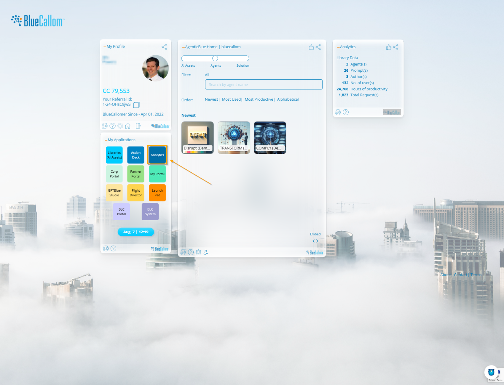
You can access the dashboard by clicking on the **Action Deck** button from your main applications screen.
Permissions and Visibility
The data visible in the Analytics Dashboard depends on your role within the organization. This ensures that users see the information most relevant to them while providing comprehensive oversight for administrators.
* **User:** Can view analytics related to their own activity and the assets they have used.
* **Manager:** Can view analytics for their entire organization (department or team).
* **System Manager:** Has the highest level of visibility and can view aggregated analytics across all organizations within the company.
### 1. Overview Tab
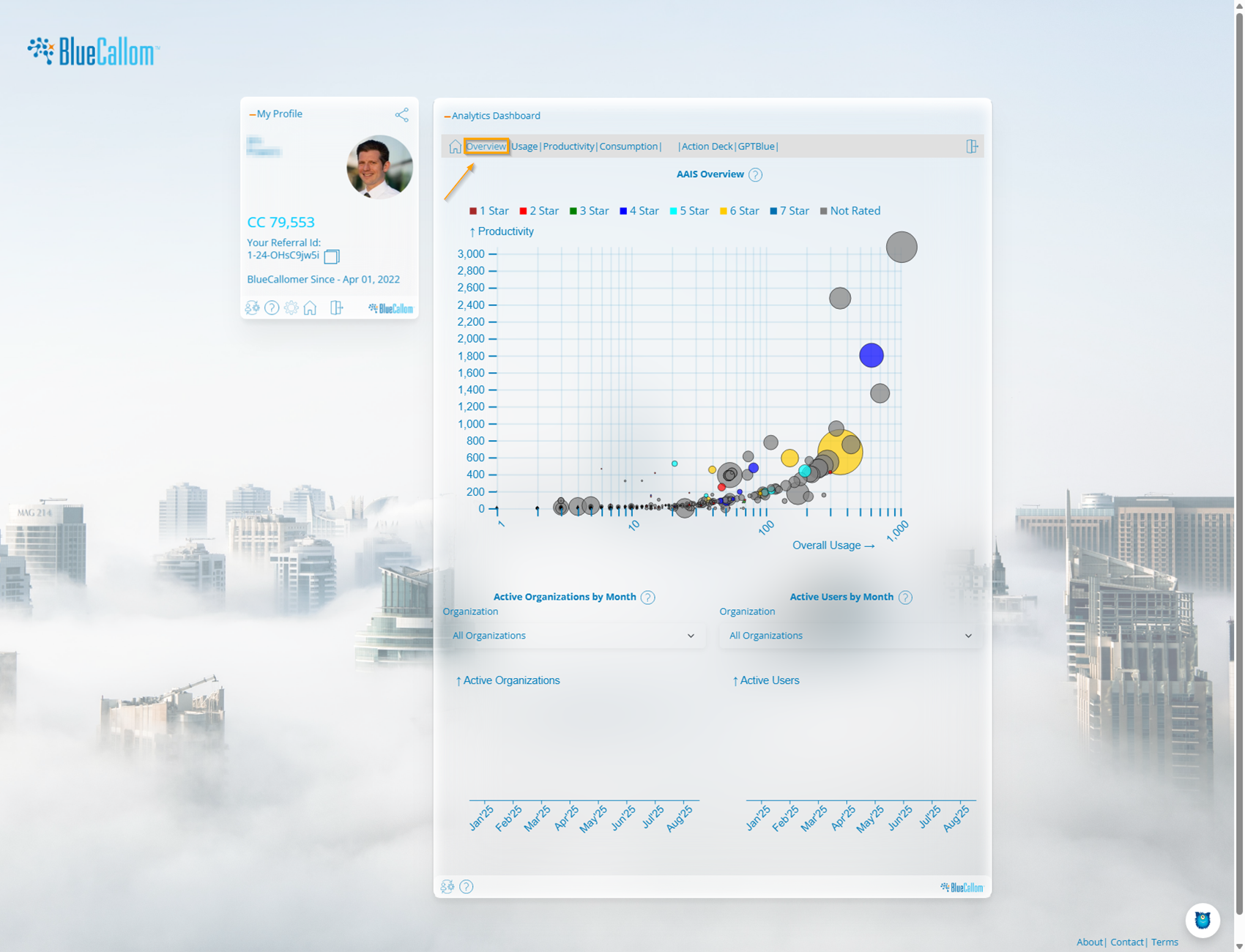
The Overview tab provides a high-level, at-a-glance summary of AI Asset performance and user activity across the platform.
AAIS Overview (AI Asset Intelligence Score)
This bubble chart is the centerpiece of the overview. It plots the relationship between the **Overall Usage** of an AI Asset (x-axis) and its **Productivity** gain in hours (y-axis).
* **X-Axis (Overall Usage):** Represents how many times an AI Asset (Prompt, Agent, or Solution) has been run.
* **Y-Axis (Productivity):** Represents the total estimated hours of manual work saved by that asset.
* **Bubble Size:** The size of the bubble corresponds to the number of times the asset has been used. Larger bubbles indicate more popular assets.
* **Bubble Color (Star Rating):** The color of the bubble represents the average user rating of the asset, from 1 Star to 7 Stars.
**How to Interpret:** Look for large, highly-rated (e.g., green or blue) bubbles in the top-right quadrant. These are your most valuable assets—they are used frequently and deliver significant productivity gains. Small bubbles in the lower-left may be new, niche, or underperforming assets.
#### Active Organizations & Active Users
These two charts at the bottom of the page track user engagement over time.
* **Active Organizations by Month:** Shows the number of distinct organizations (departments/teams) that have used at least one AI Asset each month. This helps you track the breadth of AI adoption across the company.
* **Active Users by Month:** Shows the total number of unique users who have interacted with the platform each month. This helps you measure the depth of individual adoption.
### 2. Usage Tab
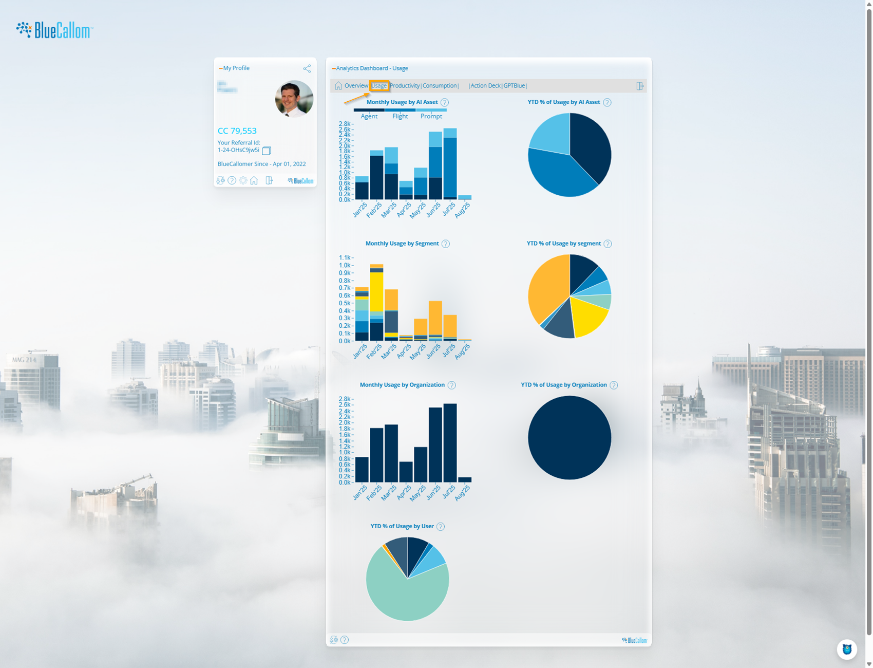
The Usage tab provides a detailed breakdown of which assets are being used, by whom, and for what purpose.
This tab features four pairs of charts. For each category, you get a **Monthly Usage** bar chart showing trends over time and a **YTD % of Usage** pie chart showing the cumulative distribution for the year.
* **Usage by AI Asset:** Breaks down usage by the type of asset: **Agent**, **Flight**, or **Prompt**. This helps you understand if users are running granular prompts or complete end-to-end solutions.
* **Usage by Segment:** Shows which business categories or functions (e.g., Marketing, Strategy, Finance) are consuming the most AI resources.
* **Usage by Organization:** Displays which departments or teams are the most active on the platform. (This chart is most relevant for System Managers).
* **Usage by User:** Shows the distribution of platform usage among individual users.
### 3. Productivity Tab
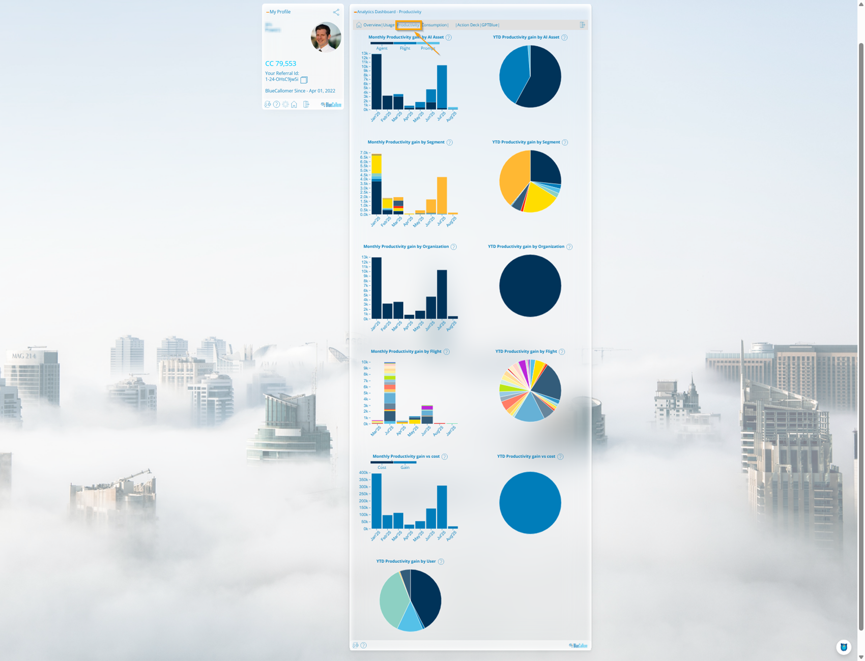
The Productivity tab quantifies the return on investment (ROI) of your AI program by translating usage into hours saved.
Similar to the Usage tab, this section provides monthly and year-to-date charts for various dimensions.
* **Productivity gain by AI Asset:** Shows the total hours saved, broken down by asset type.
* **Productivity gain by Segment:** Highlights which business segments are achieving the most significant time savings.
* **Productivity gain by Organization:** Identifies which departments are getting the most value from the platform.
* **Productivity gain by Flight:** Provides a granular view of the productivity generated by each specific Solution (Flight).
* **Productivity gain vs cost:** This critical chart directly compares the productivity value gained (in blue) against the CC cost (in gray), giving you a clear view of your monthly net benefit.
* **Productivity gain by User:** Shows which users are the most effective at leveraging AI to save time.
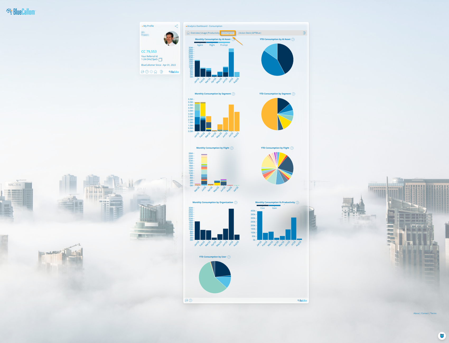
### 4. Consumption Tab
The Consumption tab provides a detailed financial overview of your BlueCallom Coin (CC) expenditure. This is crucial for budget management and cost allocation.
This tab follows the same monthly and YTD structure to show where your coins are being spent.
* **Consumption by AI Asset:** Breaks down CC spending by **Agent**, **Flight**, and **Prompt**. This helps you identify your most expensive asset types.
* **Consumption by Segment:** Shows the CC cost associated with each business segment.
* **Consumption by Flight:** Provides a granular view of the cost of running each specific Solution.
* **Consumption by Organization:** Helps you attribute costs to different departments for budget-tracking purposes.
* **Consumption Vs Productivity:** A visual representation of cost versus value. This chart compares the total CCs spent against the total productivity hours gained each month.
* **Consumption by User:** Shows the distribution of CC spending among individual users, helping to identify power users or potential areas for optimization.
---
# Agent Instructions
This documentation is published with GitBook. GitBook is the documentation platform designed so that both humans and AI agents can read, navigate, and reason over technical content effectively. Learn more at gitbook.com.
## Querying This Documentation
If you need additional information that is not directly available in this page, you can query the documentation dynamically by asking a question.
Perform an HTTP GET request on the current page URL with the `ask` query parameter, and the optional `goal` query parameter:
```
GET https://bluecallom.gitbook.io/enterprise-ai-platform-guide/system-manager-guide/analytics.md?ask=&goal=
```
`ask` is the immediate question: it should be specific, self-contained, and written in natural language.
`goal` is optional and describes the broader end goal you are ultimately trying to accomplish on behalf of the user. GitBook uses it to tailor the answer towards what is most useful for that goal.
The response will contain a direct answer to the question and relevant excerpts and sources from the documentation.
Use this mechanism when the answer is not explicitly present in the current page, you need clarification or additional context, or you want to retrieve related documentation sections.